Designing the System Behind the National Services
Built a shared design-to-code foundation adopted across 7+ digital services.
- Design System
- Design to Code
- Governance
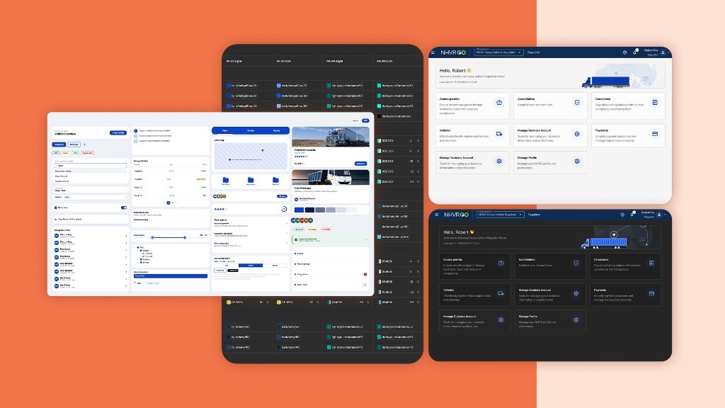
I led NHVR’s third design system initiative after two earlier attempts struggled to gain adoption. The problem wasn’t the quality of the components — it was fragmentation, ownership and the gap between design and production.
I brought three disconnected UI foundations into one token-driven, multi-theme system designed around adoption, contribution and long-term governance — not simply publishing another component library.
- 7+ digital services
- 1,200+ tokens (472 semantic)
- 4 themes
- Shared design-to-code foundation
Project snapshot
| Role | Principal Product Designer |
| Organisation | National Heavy Vehicle Regulator |
| Scope | Design system strategy, foundation, tokens, rules, governance, coding and organisation wide adoption |
| Domain | Government · Complex Workflows · Design Systems |
| Tools | Figma Variables · Figma API · Github · TypeScript · React · Storybook |
The challenge
The organisation didn’t need another component library. It needed one teams would use.
NHVR already had design-system attempts behind it, but product teams continued working across three independently maintained UI foundations.
That created duplicated components, inconsistent patterns and a growing gap between what existed in design and what engineering actually shipped.
The challenge wasn’t simply to standardise the interface.
It was to create a shared foundation that could work across products, brands and delivery teams without becoming another library teams worked around.
Why it was complex
Three foundations, one system
Existing products were built on different UI libraries and technical foundations. Consolidation had to happen without stopping product delivery.
Multiple products and themes
The system needed to support different services and brand expressions while maintaining the same underlying design language.
Design and code had to stay aligned
A component in Figma wasn’t enough. Tokens, themes and component decisions needed to translate into production.
Adoption couldn’t be mandated
Internal teams and external delivery partners needed clear ways to use, extend and contribute to the system without fragmenting it again.
Complex data grids and workflows
Design system needed to support some of the most complex excel file workflows which would result in the complex data grids and workflow patterns.
My role
Designing the system around adoption, not just components.
I worked across system strategy, design architecture, technical implementation and governance — connecting the design and engineering sides of the system.
System Strategy
Defined the architecture and principles for consolidating fragmented UI foundations into one scalable system. Build a solid architecture that can scale beyond libraries in use.
Design Architecture
Created the token structure, themes, component foundations and reusable interaction patterns across products.
Design-to-Code
Connected Figma variables and tokens with the implementation layer so design decisions could translate consistently into production.
Governance & Adoption
Established contribution, documentation and governance practices that allowed internal teams and external partners to extend the system without creating new fragmentation.
Selected work
01 — From fragmented libraries to one foundation
Creating a shared language across products.
Consolidated three independently maintained UI foundations into a common architecture for tokens, components and patterns.
System Architecture Component Strategy Standardisation
02 — From design decisions to production tokens
Connecting Figma and code.
Created a token-driven foundation spanning colour, typography, spacing and theming, giving design and engineering a shared source for product decisions.
Design Tokens Figma Variables Design-to-Code
03 — From library to operating model
Making adoption part of the design.
Established governance and contribution workflows so product teams and external partners could use and evolve the system without creating another generation of disconnected components.
Governance Contribution Model DesignOps
Impact at a glance
One shared foundation
Replaced three independently maintained UI foundations with a shared, token-driven design system.
Built for scale
Established 1,200+ design tokens (472 semantic) and four themes supporting a large library of reusable components and patterns across 7+ digital services.
Less duplication
Reduced duplicated component work by 60% as teams moved onto shared foundations.
Faster design-to-development
Reduced design-to-development handoff time by 80% through a shared Figma-to-code foundation.
Proven through change
When the Portal was later rebranded to NHVR Go, the new experience could build on the existing token foundation rather than requiring the underlying system to be rebuilt.
Private deep dive
Go behind the system.
What you see here is only a glimpse of the project.
The full case study covers the original problem, what I discovered along the way, assumptions that proved wrong, directions I explored, trade-offs I made, and how feedback changed my thinking.
Request access for the complete decision trail — through to the final outcome and impact.
- System Strategy
- Token Architecture
- Figma Variables
- Component Architecture
- Design to Code
- Multi-theme Development
- Storybook and Governance
- Adoption